")
In a world where the work experience is increasingly measured through the lens of senses and emotion, colour is no longer a decorative afterthought. It becomes a living substance, capable of shaping people’s mood, unlocking creativity and nurturing human connection. Now more than ever, colour design in the workplace is proving to be a strategic tool that reaches far beyond surface aesthetics.
The Office Is Back
According to KPMG, 83% of CEOs expect a full return to the office within the next three years. While this may mark the end of remote work as an exception, it also calls for a radical rethink of what a workplace should be: no longer a container of function, but an ecosystem that can inspire, engage and retain talent.
The modern office is not just a physical setting, but an environment that drives purpose, accountability and belonging. Yet only 15% of employees worldwide say they feel genuinely inspired by their workplace—according to Gallup’s 2024 findings. That leaves room, and need, for radical transformation.
Colour as an Invisible Lever of Productivity
Among the most powerful yet often overlooked tools is colour. Studies at the University of British Columbia suggest its strategic use can boost productivity, performance and creativity by up to 31%. But its impact goes deeper than numbers: it shapes perceptions, triggers behaviours and influences moods on a largely unconscious level.
Energising tones like yellow or orange foster movement and collaboration. Nature-inspired hues such as greens and browns create calm and clarity. Traditional neutrals, when layered and warmed, lend depth and comfort to more formal settings.
Towards the Emotional Office
Trend forecasts from STEPIC and WGSN point to one clear direction: from Feel Appeal to Play Power, from Dopamine Brights to Alt-Optimism, the future of design puts sensory experience centre stage. And not just in offices—this shift spans hospitality, residential, and retail as well. There are multiple design strategies to explore:
- Bright, vibrant tones: bold palettes that energise creative teams.
- Natural greens: biophilic shades that turn open spaces and meeting rooms into immersive sanctuaries.
- Classic tones: timeless hues drawn from mid-century aesthetics to craft welcoming and elegant spaces.
- Layered neutrals: warm neutral tones used in layers to enhance comfort, focus and emotional wellness.
- Refreshing pastels: soft, calming colours that align with Gen Z’s emotional awareness.
Let’s look at these approaches more closely.
Bright, Vibrant Tones
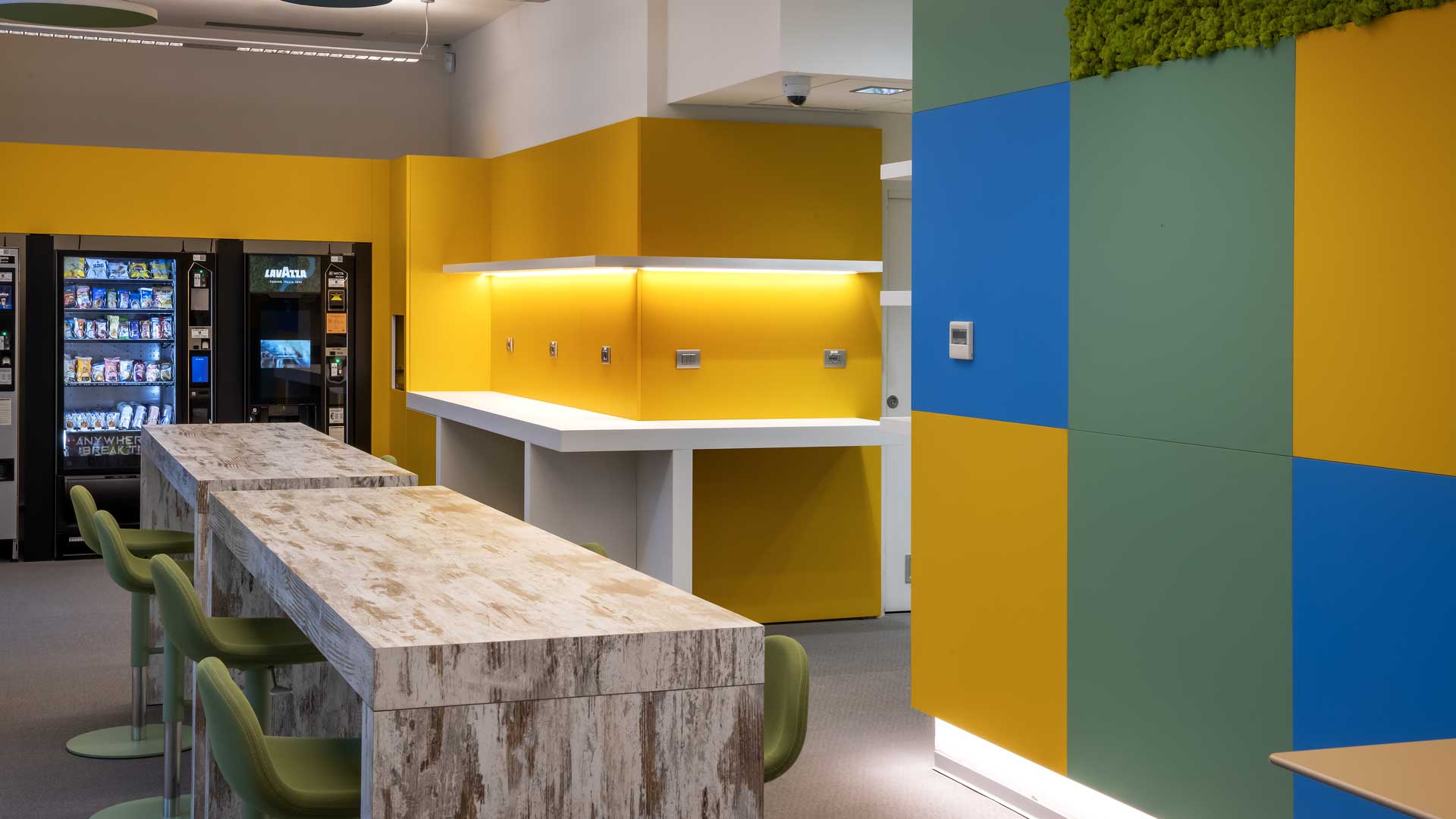
Primary colours reimagined with bold energy can spark dynamic interactions. Colour blocking with intense, contrasting shades enhances creativity and spontaneity. Some of the most effective strategies draw from the Bauhaus legacy: citrus orange, sunlit yellow, electric indigo, bold crimson. Colour becomes an expressive tool to define transformative environments, rich in unexpected details and playful energy.
Contrast, applied with intention to curtains, partitions, furniture or screens, adds a touch of theatre. Accents on smaller elements offer layered visual interest without clutter. Saturated monochromes on selected surfaces keep the look clean and sharp, with a crisp, modern edge.
Natural Greens
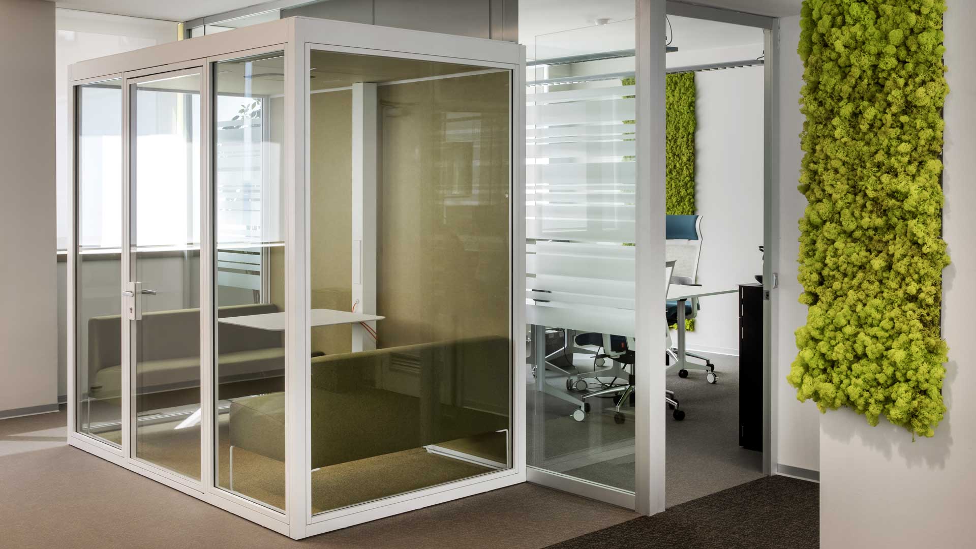
Bringing colour, texture and nature into the office creates sensory havens that foster focus, relaxation and emotional connection. Popular tones include forest green, olive, and kelp—ideal for cafés and social areas. These pair effortlessly with earthy neutrals to heighten the biophilic effect.
Awareness of the link between climate health and collective wellbeing is growing, pushing demand for greenery inside the workplace. Brands can respond with sensorial palettes, organic finishes and living plants. Covering acoustic walls, pods and partitions with natural materials creates immersive, intimate spaces that echo the presence of nature.
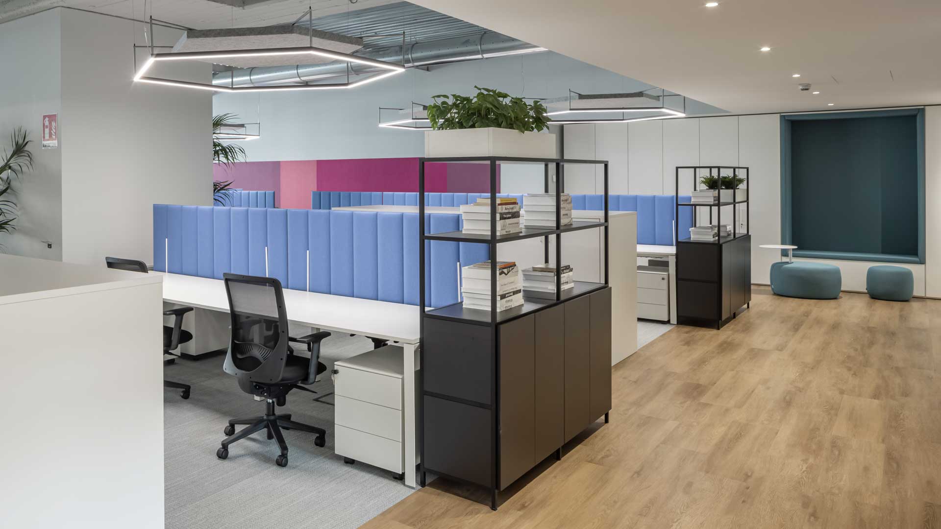
Classic Tones
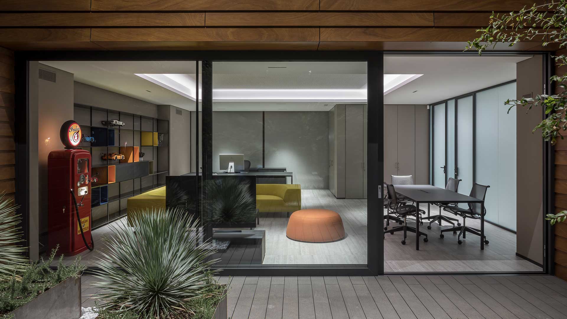
Workplace palettes increasingly draw from mid-century modernism and jewel tones, blending warmth, craft and understated elegance in spaces that echo premium hospitality. Design choices lean into saturated, nostalgic hues—sepia, cacao, deep red, Dutch blue, ochre—evoking comfort and quiet sophistication.
Paired with black architectural accents, these colours bring timeless clarity. Materials add tactile depth: from soft rugs and textured finishes to metallic details. Jewel-toned seating is matched with dark woods on desks and cabinetry. Even break areas evolve: rich hues and lounge vibes create a more intentional pause, steeped in quality and care.
Layered Neutrals
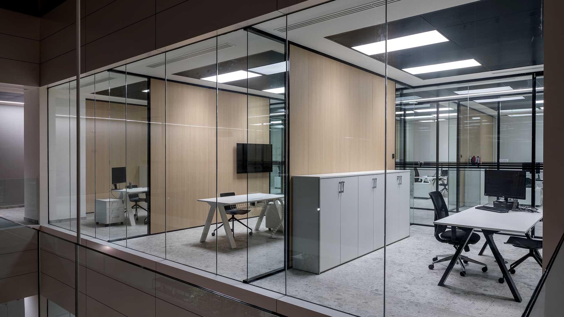
A palette designed to last—meant as a long-term investment—mirrors the broader shift toward wellness-oriented workspaces. Layering warm neutrals with tactile surfaces updates traditional office colour codes with a calming twist.
Wellness-inspired design now shapes the way we build offices. According to McKinsey, eight in ten people worldwide place wellbeing at the centre of their everyday lives. Mineral shades like beige, bone, chalk and stone offer harmony and versatility. Subtle material contrasts add tactile pleasure. These hues shine on walls, textiles and structured finishes. They’re ideal for full-room use in social or breakout spaces, where matte, satin and gloss finishes can be mixed to keep the eye engaged.
Refreshing Pastels
Muted, luminous colours bring an uplifting alternative to conventional office schemes, adding youthful spirit that speaks to the values of Gen Z. Popular strategies pair soft matte shades—lavender, baby blue, blush, terracotta—with neutral backdrops and crisp forms. Monotone layering adds depth, while pearlescent or iridescent accents lend a forward-looking edge. Used consistently on desks, seating and communal tables, pastels become a design language of their own—fostering ease, wellbeing and a quiet sense of inclusion.
An Investment That Speaks of People
In 2023, wellbeing among under-35s dropped from 35% to 31%—a small decline, yet telling of a deeper malaise. In this context, reimagining the workplace isn’t just about real estate—it’s about intent. It’s about offering spaces that inspire, support and include. And yet, fewer than one-third of offices worldwide have been renovated in the past three years. The numbers are clear: when colour is designed with purpose, it impacts both performance and motivation.
Colour, Culture, Identity
Ultimately, colour in the workplace becomes a cultural gesture. A way for organisations to speak to those who inhabit their spaces, day in and day out. A subtle but decisive form of narrative.
It’s through this lens that productivity is being redefined—not as output, but as the quality of thought, time and presence. And it may all begin with a single hue.